Subscribe to Our Newsletter
Stay updated with the latest tips and strategies. Get additional discounts and alerts on offers.
As we head into 2018, it’s time to look forward and consider some of the more popular design trends that will become commonplace. Many elements, mechanics, and concepts were introduced or perfected throughout 2017 and will continue to take precedence in the years ahead.
Mobile and responsive design especially are now favoring higher-quality visuals, animation, and even alluring typography. What is happening on the whole? What is it you will absolutely have to be on board with as we enter the new year?
Back in 2016, mobile internet traffic surpassed that of desktop for the first time ever. That trend has continued and will continue into the future. Throughout 2017, 52.99 percent of all internet traffic came from mobile devices, up from 44.69 percent the year prior. Mobile is not just a big deal — it is the big deal. Mobile-friendly and responsive web design is more important now than it’s ever been, and if it’s not at the top of your priority list already, it needs to be.
The AMP, or accelerated mobile pages, the initiative has become increasingly important, especially with Google now placing emphasis on it in mobile search results. In early 2018, Google will also be rolling out its Mobile-First Index which will change the landscape considerably. You do not want to be left behind in the dust.
Technology has become more powerful, more advanced, and much more capable — and that includes your average mobile device or smartphone. Along with that has come an evolution in modern design to include more attractive imagery, accompanied by animation. Full-size videos in the background of a web page, subtle animations and focus points, and high-resolution images and videos galore are commonly seen in web design. That’s not even touching on the bold and bright fonts and typography revered in modern design.
In the past, these elements would seriously hinder or bog down performance, ruining the user experience. While that can still certainly happen if you don’t play your cards right, it’s less likely than ever before. That also means designers and developers are willing to take bigger risks with flashy components and themes.

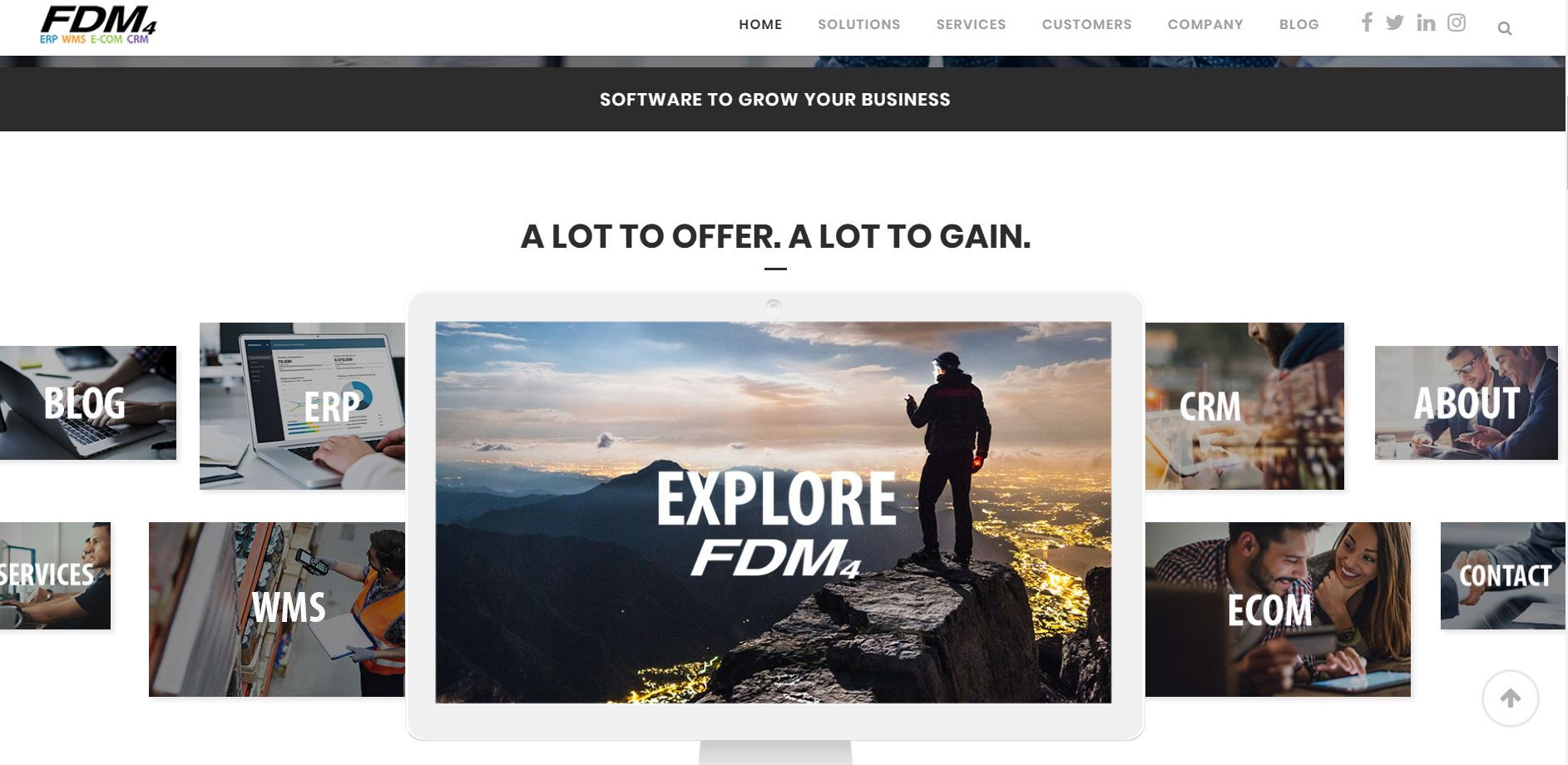
Expect to see a whole lot more of this, especially into the far reaches of 2018. Modern, minimal designs are favored for sure, but it’s because they are often stunning and beautiful. The same can be done with flashy elements, especially in the right context. The FDM4 site is an absolutely gorgeous and captivating example of this in action. Check out the integrated video and how it looks, complementing the rest of the design.
Thanks to the birth of social media, consumers, and audiences now realize the value of sharing micro-interactions with the world. They include engagements such as likes on Facebook, retweets on Twitter, and even reblogs on Tumblr. Of course, there are a whole lot more examples and networks out there, so that’s not a comprehensive list.
The point is simply that micro-interactions are popular and here to stay, and they’re being incorporated in third-party services and platforms, as well as mobile apps. Expect to see the same types of interactions adopted on a variety of websites — retail, e-commerce, and content-heavy alike. In fact, micro-interactions are often preferred by users, allowing them to weigh in on a discussion or activity without refreshing or reloading pages or submitting form data.
It’s much easier to simply love and share a blog right from a single page than to navigate away and engage further. It’s also more immersive, allowing you to stay on a particular site or portal for longer. Lower bounce rates and higher engagements are positive for nearly every brand or site admin out there, so it’s likely designers will be asked to include these experiences in future developments.
The best and most prominent example of this in action is Tinder’s swipe-based interactions. You’ve no doubt heard the phrase swipe right for yes. The system has pretty much become a staple of modern online dating experiences.
From iPhone’s Siri to Google’s Assistant, mobile devices are really starting to shine in regards to voice activation and dictation tools. Now the technology has moved into other areas of a consumer’s home, including smart speakers like Amazon Echo (Alexa) and Google Home, which can control a lot of devices and hardware. This will translate to more convenient situations for consumers, including those visiting their favorite websites.
Voice-activated and voice-navigated tools will be used in the near future to facilitate interaction with modern websites. For example, a voice assistant can crawl into a content-heavy site and summarize the most important points found. This would be beneficial to those who are particularly busy and need bite-sized updates, rather than time to read an entire article or watch a lengthy video summary.
More importantly, the foundation of websites will need to be structured to allow these kinds of voice-enabled engagements and interactions — which means the burden falls to the design and development world. Expect to be asked or required to craft these kinds of unique experiences, embedding the necessary elements within your design and layouts going forward. While not exactly website-related, Alexa can do a great many things through voice commands such as order new products, turn on lights or household appliances, play music, and much more.
If one thing can be gleaned from the emphasis on modern experiences — namely with animation and engaging designs — it’s that customers want to be more involved. This will call for more dynamic and interactive content, like on-site quizzes and polls, and even mini-games. You may have noticed quizzes, in particular, are incredibly popular on networks like Facebook. People love to take a quiz, get a response, and share it with the world.
This is just one way they’re engaging and interacting with the modern web, and those kinds of experiences will soon be necessary, even across portals you wouldn’t expect them to be.

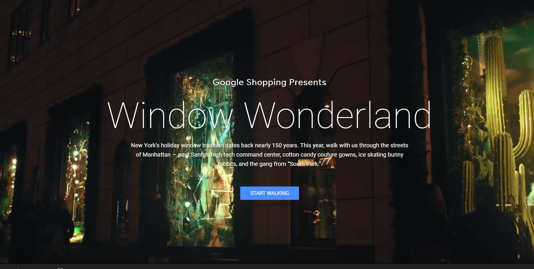
Retail and e-commerce sites are already catching on too, which is why there are so many contests and promotions going on. Google’s Window Wonderland takes you on a virtual tour through the streets of Manhattan, New York.
The title statement is a bold one to make. If you really wanted, you could claim every year as one rife with opportunity and promise. However, looking back at the trends of 2017 and everything that’s coming to fruition for the coming year, it’s tough to argue against an incoming golden age. Devices — particularly mobile — are much more capable, and customers and audiences are more engaged than ever before.
This will lead to something of a new world for modern web experiences and design. We’ll be at the helm of crafting these experiences, and really fine-tuning the mechanics and elements that make it possible. Get ready for a wonderful year of design and wonder.
Subscribe to Our Newsletter
Stay updated with the latest tips and strategies. Get additional discounts and alerts on offers.
Related Articles
Subscribe to Newsletter
Stay up to date with the latest marketing, sales, and service tips and news.